Responsive web design with Bootstrap and Node.js As A Backend
With the evolution of technology, many things have changed over the years. More specifically, if we talk about the size of computer, it has been reduced drastically. These days, we can carry our computer like mobile phones, tablets, smart-watches etc. along with us anywhere. Moreover these gadgets require internet connection for their optimal use. So, to make the users of these gadgets to able to browse through different websites, it becomes most important for the web designer to keep this point in mind while designing the webpage. So, this is where the concept of responsive web design emerged.
According to wikipedia, Responsive web design is an approach to web design that makes web pages render well on a variety of devices and window or screen sizes.
So, in this blog, we’ll discuss the procedure to make responsive web page for a hypothetical organisation which will enable it to store the ID and name of its employees. This front-end web page will be served by a server built on Node.js which will be linked to a SQLite3 database to store datas.
This entire project is also available in my GitHub repository —
Following are the two videos of the final look of our project :-
Prerequisites
- Knowledge of — HTML, CSS, JavaScript, JQuery, Bootstrap, Font-awesome, Node.js and SQLite3
- 2. Node.js and SQLite3 should be installed in your machine.
So, it’s time to start our project.
Step 1: Open the terminal and create a directory for the project and navigate into it. Then run `npm init` command and you’ll be asked to enter various details about your application, which will be stored as a json file named package.json. Now, we’ll install the dependencies for our project like body-parser, express, express-rate-limit, helmet, socket.io and sqlite3 by running the following command —
npm install — save body-parser express express-rate-limit helmet socket.io sqlite3Then, we’ll install the development dependencies like babel-cli, babel-preset-env and babel-preset-stage-0 using the following command -
npm install — save-dev babel-cli babel-preset-env babel-preset-stage-0Then, we’ll create a file named .babelrc in our project directory, which will be opened in a text editor and the following text will be entered -
{
    "presets": [
                 "env",
                 "stage-0"
               ]
}
So, we’ve created the project environment. Now, let’s discuss the modules we’ve used.
Express — It is fast, unopinionated, minimalist web framework for node.
Babel — Babel is a toolchain that is mainly used to convert ECMAScript 2015+ code into a backwards compatible version of JavaScript in current and older browsers or environments.
Socket.IO — It enables real-time bidirectional event-based communication.
Body-parser — Its a Node.js body parsing middleware.
Sqlite3 — Its an asynchronous, non-blocking SQLite3 bindings for Node.js.
Express-rate-limit — Its a basic rate-limiting middleware for Express which is used to limit repeated requests to public APIs and/or endpoints. by limiting the number of requests to the server, we can prevent the Denial-of-Service (DoS) attacks. It is a type of attack where the server is flooded with repeated requests making it unavailable to its intended users and ultimately shutting it down.
Helmet — Helmet helps us to secure our Express apps by setting various HTTP headers. It helps in mitigating cross-site scripting attacks, misissued SSL certificates etc.
Step 2: Now we’ll create two directories named public and database. In the public directory, we’ll create three html files with names index.html, about.html and contact.html respectively. We’ll also create four additional html files in the same directory with names addemp.html, viewemp.html, modifyemp.html and delemp.html respectively for facilitating the user to perform insert, read, update and delete operations respectively.
While writing html codes, our main focus will be on making the webpage responsive.
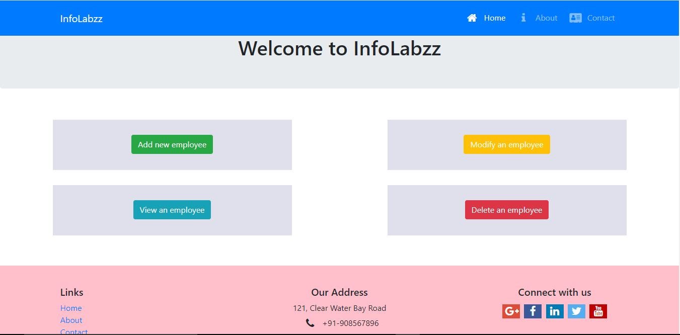
So, lets begin with our first page index.html.
In this page, we’ve linked Bootstrap, font-awesome and static CSS codes under <style> element. This page contains the link to all other pages.
To design this page and all the other pages, we’ve used bootstrap grid system . The page layout will change depending on the screen size of the device.
Now, the second page will be about.html, where the description of the company will be there. The HTML code for this page can be found in —

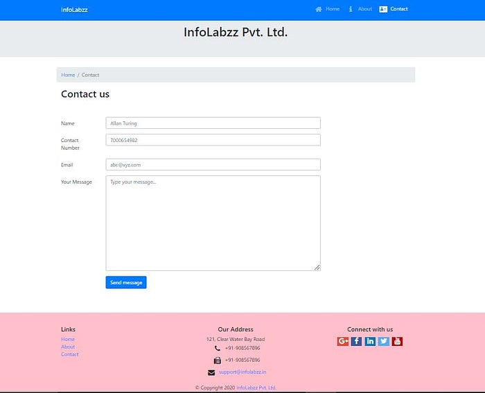
The page named contact.html will enable the user to send message to the organisation. Its HTML code is mentioned below —
The above code is almost similar to index.html except two things that we have used here but not in index.html. First is the HTML form to facilitate the user to enter his personal details and the message. Second is the event emitter to notify the user about the status of the operations that they are performing.
Now, the last four pages named addemp.html, viewemp.html, modifyemp.html and delemp.html respectively which will enable the user to store, view, modify and delete employee datas. The HTML codes for all of these pages can be found in —
- https://github.com/souvik-pl/Responsive-web-dev/blob/main/public/addemp.html
- https://github.com/souvik-pl/Responsive-web-dev/blob/main/public/viewemp.html
- https://github.com/souvik-pl/Responsive-web-dev/blob/main/public/modifyemp.html
- https://github.com/souvik-pl/Responsive-web-dev/blob/main/public/delemp.html


Step 3: Now, we will write codes for our backend. When the user wants a static page, the browser will send a GET request to the server and when the user wants to enter data in HTML forms, the browser will send a POST request to the server.
When the POST request will be received the server, it will try to do the operation defined in the code. If it fails, server will emit an event which will be received by the browser.
io.emit(‘result’, ‘An error occurred’);And if the operation is successful, again the server will emit an event which will be received by the browser to show the user about the status of the operation.
io.emit('result', 'Message sent successfully');So, the code for our server application is as follows —
To get the explanation of the above code, it is recommended to visit this link —
To understand socket.IO, please visit this link —
Step 4: So, our server application is ready. We’ll save it and go back to terminal to run this using the command node app.js. The following message will be displayed in the console -
Server listening on port: 3000So, now our server is up and running. We’ll open the browser and enter http://localhost:3000 in the address bar to access the website.
Summary
If you have reached this point, that means you have responsive web pages at the client side and a Node.js server in the server side.
Congratulations!
Enjoyed this article? If so, get more similar content by subscribing to Decoded, our YouTube channel!
References
Bootstrap 4: https://getbootstrap.com/
Express module: https://www.npmjs.com/package/express
sqlite3 module: https://www.npmjs.com/package/sqlite3
body-parser module: https://www.npmjs.com/package/body-parser
express-rate-limit module: https://www.npmjs.com/package/express-rate-limit
Helmet module.: https://www.npmjs.com/package/helmet
Socket.io: https://socket.io/
Babel: https://babeljs.io/docs/en/
Responsive web design: https://en.wikipedia.org/wiki/Responsive_web_design

