I Tried Uber’s React Web Components Library
Uber’s open source component library for all your UI needs

The internet is filled with React libraries, I think it’s safe to say we’re close to reaching an equilibrium between the number of React component libraries and JavaScript frameworks released per week. No joke.
However, while Joe’s opinionated list of components might not make the headlines when a company with a very popular application decides to open source the way they structure their UI, you better listen. Mind you, it might not be right for you, but it’s still a very tried and true library. It’s not like they suddenly decided to create it from scratch and release it, they’ve gone over it and they’ve used it for a while before making the call. That has to mean something, doesn’t it?
In this article I’ll give you a quick summary of what it’s like to use Uber’s component library.
Let’s build something
To show you something practical, instead of going over a list of features, I’m going to build a very basic password generator app. I’m taking the cue from their own documentation, but I’m just going with a very simplistic version of it, to show you how easy it is to get started.
If you’ve never used React before, you might want to read up on it a bit, at least about hooks before moving forward.
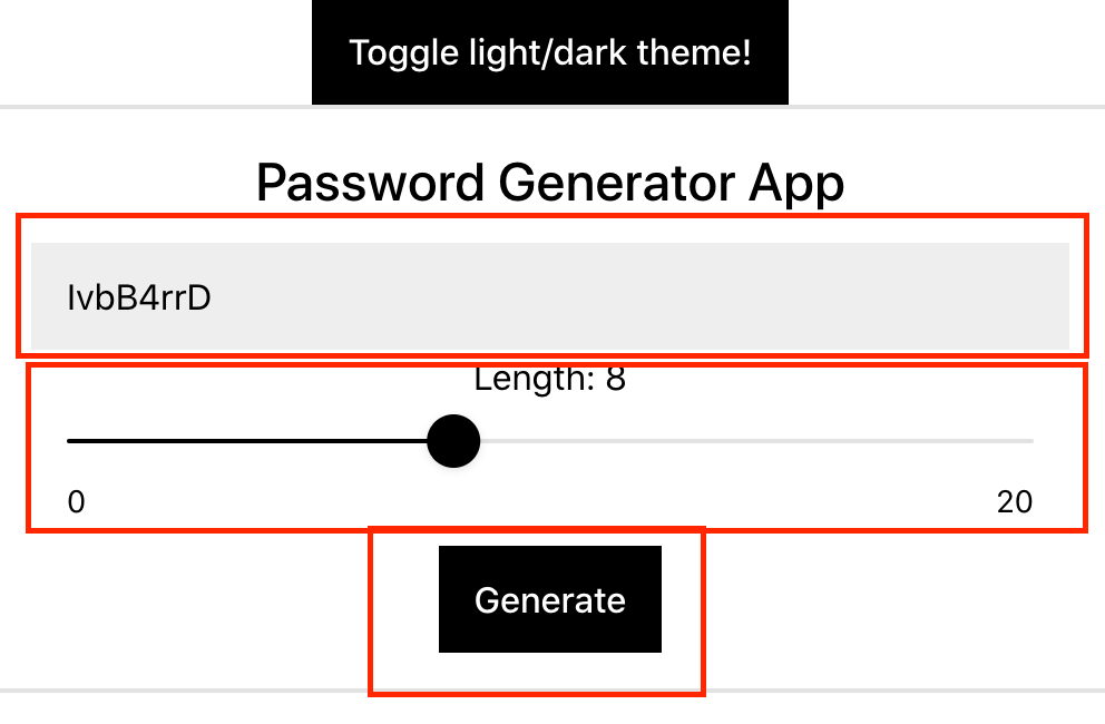
Here is the app I’ll be building:

As you can see, we have a couple of standard elements (an input and a couple of buttons). A slider component interacting with the rest of our elements and to top it all out, a quick theme changer to show you how stupidly easy it is to affect the styles of your app.
Let’s get started.
The initial setup
Getting started doesn’t require anything strange, all I used was the create-react-app command:
$ npx create-react-app pwd-generatorAnd then, once I was inside the folder, adding the Base Web library, is as simple as doing:
$ npm install baseui styletron-engine-atomic styletron-reactThat is all you need. The baseui package contains all the components you’ll be using. On top of that Styletron (which is a library for component-oriented styling) is added to provide styling and theme support.
Building the basic layout
The basic layout for our component will be done using the Block element, which allows us to group other elements in a very intuitive way.
In the above image, I’ve marked out the 3 blocks we’re going to be using for our layout. Since this is a very basic UI, we don’t need any fancy constructs, but if we needed to create a grid-based layout, we could also rely on the FlexGrid element. However, since we don’t, we’re good to go with something as simple as this:
Now we can start inserting the actual interactive elements, we’ll use an Input element, a Slider and finally a Button element. Notice how Base Web also brings replacements for the most basic elements. These are wrappers mean to simplify adding extra behavior and styling.
A slider component interacting with the rest of our elements and to top it all out, a quick theme changer to show you how stupidly easy it is to affect the styles of your app.
The final code of our component (the returned value at least) looks like this:
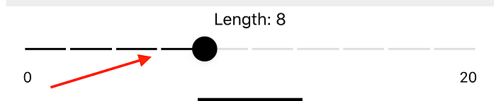
Both the Button and the Input components are quite straightforward to be honest, there is not much to say about them. However, the Slider has some interesting properties, in the above example you can see the min and max values, which dictate how far in both directions the value can go. You can also set things like a step to move using values different than 1.
Notice what happens if I add the marks prop and the step property set to 2. Now I’m moving 2 by 2 and there are marks set to show where the sliding indicator will land next.
Let’s now jump to see how we can connect all these elements together.
Adding behavior
As you could see from the above example, we’re using two state variables: pwd and pwdLength which represent the actual password generated and the length to be used on the generation script. We’re also going to need two functions updatePwdLength and generatePassword . The first one will update the state variable pwdLength and the second one will generate the actual password using the value from pwdLength and a quick algorithm I borrowed from StackOverflow.
We’re using the State Hook twice here, as you can see because both pwd and pwdLength are stateful variables (meaning, we’re keeping track of their value because part of our component depends on them).
Notice how the initial value of the slider’s state is an array instead of a single number. This is because you can pass an array with two values as well, and generate a Range slider:
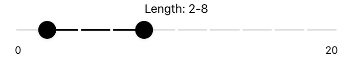
Another taste at the flexibility of this component. Notice you can only pass an array with one or two values, if you exceed that number, you’ll get an error.
Adding themes
So far, we’ve not worried about styles, and if you’ve been trying to follow along, putting the above code into a component file and exporting it, you’re not getting the above results. You’re getting completely un-styled elements that don’t really work as you’d expect.
Base Web ships with a centralized theming system, which all components then use. This means you can affect the system-wide theme from a single place, without the need to create custom components to override specific styles.
For you to start using themes, you have to configure a provider for the theme at the root level of your application. This is done through the BaseProvider component. You can also use the ThemeProvider which allows you to specify a custom theme for a section of your application. But because right now we’re only looking to get the basic styles up and running, we’re going to focus on the first one.
The following code shows the layout for the App.js file of our application. Notice the PasswordGenerator component there, that’s the one we’ve been working on so far.
The Card component is just a layout helper which allows us to also add a title. The two providers you see in the code are the ones doing the magic. And in fact, the one we really need to care about is the BaseProvider, the other one is required to be there because the entire library’s styling and theming systems are based on that engine. We can set the actual theme using the theme property of the BaseProvider.
That alone will affect every single child component. And to show you how that works, I’ll add the ability to switch themes by clicking on a button. Essentially the only change we need to make, is to make sure the value of theme is stored in our state, and then we’ll simply toggle it between light and dark:
That code will add a Button component to the Card where we added our PasswordGenerator . By clicking that button, we’re just toggling the value of the theme variable (which is coming from the call to useState ).
Let’s take another look at the final result:
You have everything there:
- Password generation triggered by the click on the “Generate” button.
- Password generation triggered by a change on the
Slidercomponent. - Usage of the value of the
Slideras part of the password generation action. - Centralized theme changing with the click of a button.
The Base Web component library from Uber is definitely an easy one to use. If you’re looking for a library that’s filled with useful components, easy styling and great developer experience, then this one is definitely up there on the list.
If you want to know more, check out their documentation. Everything is explained and with code examples for JavaScript, Flow and Typescript, which makes everyone’s life a lot easier.
Have you used this library before? Leave your comments sharing your experience!
Build micro frontends with independent components for speed and scale
Instead of building monolithic apps, build independent components first and compose them into features and applications. It makes development faster and helps teams build more consistent and scalable applications.
Bit offers a great developer experience for building independent components and composing applications. Many teams start by building their Design Systems or Micro Frontends, through independent components.
Give it a try →


