Building a customizable Modal Component with React
In this example, we will be creating a customizable Modal component with React.
Getting Started
First, let’s see how we want to use our Modal component:
Note that we’re using Modal and Modal.Content. This way we’ll be able to customize from outside both background overlay and modal content element.
Caveats
One of the best practices for displaying a Modal element is to render it in the body tag instead of inline rendering inside the parent component.
Reasons are:
- To avoid issues with
z-index. - To have the ability to show Modal even when the parent element is set to
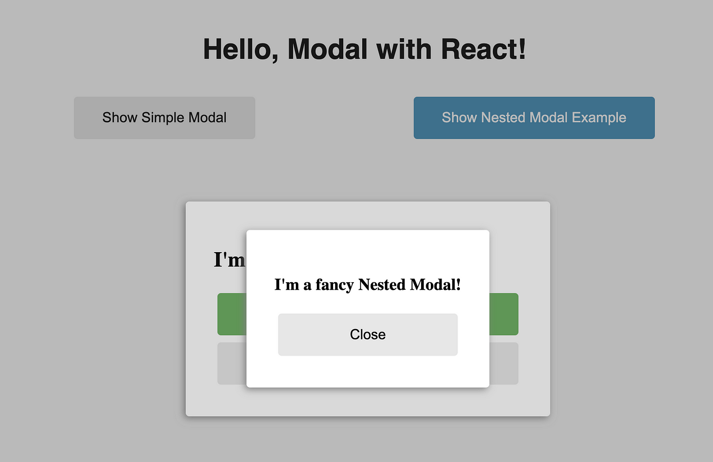
visibility: hidden. - To avoid issues when showing nested Modal inside another Modal.
In a simple scenario, we could just append Modal directly to the body element. However, there’s a more graceful way of doing it using a special Modal.Host component, where we’ll be rendering all Modal(s). This way we have more flexibility and control on where exactly to render Modal by just moving Modal.Host wherever we want Modal to be rendered:
Prerequisites
reactandreact-domclassnames— just for convenient usage of CSS modules with React
Let’s start coding.
Implementing Modal Component
Overall Modal implementation will contain:
Modal/common.js: contains shared stuffModal/ModalHost.js: containsModal.HostcomponentModal/ModalContent.js: containsModal.ContentcomponentModal/index.js: contains the mainModalcomponentModal/modal.module.css: contains CSS styles (CSS Modules)
Modal/common.js
Modal/ModalHost.js
Modal/ModalContent.js
Modal/index.js
We will use React Portal to render Modal outside of its parent element, specifically in Modal.Host.
Modal/modal.module.css
Summary
Check out the complete example in Github Repo.
Also, feel free to subscribe for upcoming articles!

